How to Use ChatGPT to Make a Logo
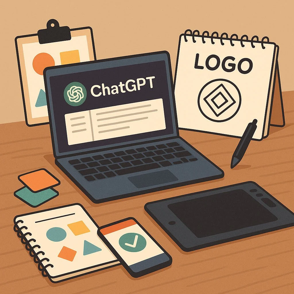
ChatGPT won’t click a mouse, but it will help you think like a designer, produce usable SVG code, and iterate quickly. Treat it as a logo system partner:
Define goals, audience, and constraints.
Explore symbolism, shape language, and typography.
Generate vector concepts (SVG) and refine.
Stress-test for scalability, contrast, and single-color use.
Package a responsive logo set with a simple brand sheet.
Everything below is hands-on with prompts you can paste.
Step 1 — Build a tight creative brief
Prompt: Logo Brief Builder
“You are a brand strategist. Help me write a logo brief. Company: [name]. Industry: [field]. Audience: [who]. Personality: [3–5 adjectives] (e.g., bold, friendly, premium). Competitors: [list]. Must-haves: [e.g., initials, icon-only variant, avoid animals, avoid gradients]. Practical constraints: [will live as an app icon, must embroider on hats, must print in one color]. Deliverables: primary lockup, icon, wordmark, dark/light versions, monochrome, SVG files. Summarize as bullets, then propose 3 distinct directions with names.”
You’ll get a single source of truth and named concepts (e.g., “North Grid,” “Warm Circuit,” “Glassleaf”).
Step 2 — Choose symbols and shape language
A good logo balances meaning (what it says) and geometry (how it holds up).
Shape cues (use these to steer concepts)
Circles: community, harmony, continuity.
Squares/rectangles: stability, trust, structure.
Triangles: motion, growth, innovation (pointing up), caution (pointing down).
Curves vs. straight lines: friendly vs. precision.
Negative space: hidden shapes = memorability.
Prompt: Symbol Map
“Generate 12 symbol ideas that express [brand values] using simple geometry and negative space. For each, give a 1-line rationale and a 1-sentence construction note (e.g., ‘45° cuts, concentric circles, 2:3 proportions’).”
Pick 2–3 favorites to prototype.
Step 3 — Typography that matches the story
Your wordmark often does most of the work.
Type direction shorthand
Techy/modern → geometric sans (uniform strokes).
Premium/editorial → contrast serif (thick/thin).
Friendly/startup → humanist sans (open forms).
Rugged/heritage → slab serif.
Speed/energy → italic or forward-leaning details.
Prompt: Type Pairing Coach
“Recommend 3 candidate type directions for [brand]: (a) primary display for the wordmark, (b) supporting UI font. For each, describe letterform traits (x-height, apertures, terminals) and how to modify R, G, S, or a to make a custom wordmark. Provide tracking and optical kerning notes.”
If you don’t own the suggested fonts, ask for open-source alternatives with similar traits—or request “outline-style lettering recipe” so ChatGPT can draw letters in SVG.
Step 4 — Color that works in real life
Pick a core + support palette and ensure accessibility.
Choose one hero hue, one neutral (charcoal or off-black), a light background, and an accent.
Check contrast at AA (4.5:1) or better for small text; your logo should also work in pure black and pure white.
Prompt: Palette Builder
“Propose 3 palettes for [brand personality] with hex codes. Include: hero, dark neutral, light background, accent. Explain the emotional read and provide a monochrome fallback.”
Step 5 — Generate actual vector logos (SVG)
ChatGPT can output clean SVG you can paste into a file. Start simple; you can refine later.
Prompt: SVG Concept (Icon-first)
“Create a simple SVG icon for [brand idea] that works at 24×24 px and at 1024×1024. Constraints: single color, geometric construction, no filters, minimal nodes, viewBox 0 0 1024 1024. Include clear comments and keep shapes as
<path>or<rect>/<circle>/<polygon>only.”
Prompt: SVG Wordmark
“Generate an SVG wordmark for the name [Name] inspired by [type direction]. Build letterforms as paths (no fonts), consistent stroke logic, optical kerning, and a baseline grid. Provide a second line with the tagline in smaller size.”
Prompt: Responsive Logo Set
“Produce 3 coordinated SVGs: (1) primary lockup (icon + wordmark), (2) wordmark only, (3) icon only. Include dark and light versions by swapping fill colors. Keep file sizes small and ensure legibility at 16 px.”
Tip: If a path looks complex, ask: “Reduce node count while preserving silhouette.”
Step 6 — Iterate like a designer (fast feedback loops)
Prompt: Critique & Revise
“Evaluate this SVG for balance, symmetry, and legibility at 16 px and 32 px. Suggest 3 micro-tweaks to improve optical balance (e.g., overshoot rounds, adjust counters, thicken stems by 4%). Then regenerate the SVG with those changes.”
Prompt: Negative Space Test
“Check the icon for unwanted tangents and crowded negative space. Propose spacing tweaks (in pixels at 1024 canvas) and rebuild.”
Prompt: Stroke & Fill Audit
“Audit strokes vs fills for embroidery and vinyl cutting. Convert any strokes to outlines, unify fills, and return an SVG with simple boolean shapes.”
Step 7 — Stress-test: tiny sizes, one color, weird backgrounds
Your logo must survive abuse.
Tiny test: Does the icon read at 16×16 (favicon) and 28×28 (app bar)?
Single color: Works in one ink on a receipt or stamp.
Reversal: Looks good as white on photos or dark backgrounds.
Print methods: Embroidery likes thicker strokes; laser-cut needs closed shapes.
Prompt: Abuse Tests
“Simulate these scenarios: (a) 16×16 favicon, (b) white on photo background, (c) 1-color stamp at 20 mm. Identify failure points and modify the SVG for each use.”
Step 8 — Create an app icon, favicon, and social avatars
Adapt the icon to common canvases.
Prompt: Icon Kit
“Generate square exports for 1024, 512, 256, 128, 64, and 32 with safe-area padding (12.5% on all sides). Provide a circular ‘squircle’ mask variant. Deliver SVG and mention recommended PNG sizes for platforms.”
Prompt: Favicon Simplifier
“Create a hyper-simplified 16×16 favicon SVG that preserves the brand’s silhouette. No internal detail under 2 px at 16 size.”
Step 9 — Assemble a mini brand sheet
Package decisions so future you stays consistent.
Prompt: Brand Sheet Writer
“Produce a one-page brand sheet: logo usage rules (clear space = icon width/4), color palette (hex + usage notes), do/don’t list (no drop shadows, no stretching, minimum sizes), file naming convention, and export checklist. Include the responsive logo set preview.”
Step 10 — If you want concept art beyond SVG
You can have ChatGPT craft image-gen prompts (for moodboards or textured marks), then return to SVG for the final.
Prompt: Moodboard Prompter
“Write 6 concise prompts for generating moodboard images matching [style] and [brand values]: specify lighting, texture, and composition cues. Keep prompts tool-agnostic and under 200 characters each.”
Prompt: Vectorization Plan
“Given this raster mark description, outline steps to redraw it as clean SVG: core shapes, alignment grid, node reductions, and safe stroke widths for embroidery/laser.”
Practical constraints & tips
Start monochrome. Add color after the shape works.
Avoid skinny details. Minimum strokes: ~1.5–2 px at 24 (scale up proportionally).
Optical corrections. Round shapes need slight overshoot above/below the baseline to look aligned.
Symmetry with intention. Perfect symmetry can look stiff—break it subtly if needed.
Name your files.
brand_icon_light.svg,brand_wordmark_dark.svg, etc.Keep originals. Save a master SVG before simplifying paths.
Copy-and-paste prompt kit (quick access)
1) Brief
“Create a logo brief for [brand] with audience, personality, constraints, deliverables, and 3 named directions.”
2) Symbols
“List 12 geometric icon ideas for [value/industry] with one-line rationale and construction notes.”
3) SVG Icon
“Write an SVG icon (viewBox 0 0 1024 1024), single color, minimal nodes, legible at 24 px. Include comments.”
4) Wordmark
“Generate an SVG wordmark for [Name] with custom letters as paths, optical kerning, and a small-caps tagline line.”
5) Responsive Set
“Output primary lockup, wordmark-only, and icon-only SVGs in dark/light. Ensure single-color variants.”
6) Tests
“Critique legibility at 16/24/32 px; suggest tweaks; regenerate with corrected strokes and spacings.”
7) Brand Sheet
“Write a one-page brand sheet summarizing palette, clear space, min sizes, dos/don’ts, and exports.”
Checklists (print these)
Design quality
Reads at 16 px and 24 px
Works in 1 color (black and white)
Balanced negative space (no tangents)
Clear silhouette (recognizable in 1 second)
Icon and wordmark feel related
Production
SVG only (no raster, no filters)
Strokes expanded where needed
File weight trimmed (no extra points)
Light/dark and mono variants
Export sizes mapped (favicon/app/social)
Brand consistency
Color rules with hex values
Clear-space rule defined
Minimum sizes documented
Do/Don’t list included
File naming convention set
Troubleshooting (common logo issues)
“Looks great large, mushy small.”
Simplify shapes, thicken strokes, remove interior cuts under 2 px at 24.
“Icon and wordmark feel unrelated.”
Echo a unique shape from the icon (e.g., 45° chamfer) inside one letter (like the R leg).
“Color feels off across screens.”
Define one brand neutral (charcoal), one hero, one accent; specify hex and keep saturation moderate.
“Hard to embroider or cut.”
Convert strokes to outlines; ensure closed shapes; avoid micro notches.
“SVG is heavy.”
Ask ChatGPT to “reduce node count,” “merge paths,” and “remove redundant decimals.”
One-hour sprint (from blank to usable mark)
0–10 min: Brief Builder → pick one concept.
10–25 min: Symbol Map → choose icon shape.
25–35 min: Generate first SVG icon.
35–45 min: Add SVG wordmark and build responsive set.
45–55 min: Run abuse tests; adjust strokes/spacing; create mono variants.
55–60 min: Write mini brand sheet and export favicon/app icon sizes.
TL;DR (finally)
Start with a sharp brief and symbol map.
Build the logo monochrome first; make sure it reads at 16–24 px.
Use ChatGPT to generate clean SVGs, then iterate: spacing, stroke weight, negative space.
Package a responsive set (icon, wordmark, lockup) in light/dark and single-color.
Finish with a one-page brand sheet so your logo stays consistent everywhere.

